
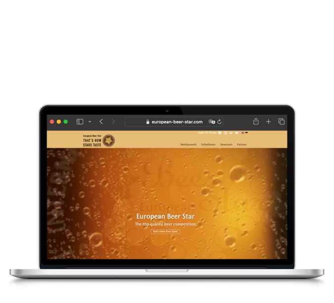
Do Not Create Separate Mobile Websites
There has been a long-running discussion going on about the mobile Web and the following question: “Is there a mobile Web?” Is the mobile device so fundamentally different that it is necessary to create several websites for it, or is there only one Web that we access using a variety of different devices? Opinions differ about this statement. In the following, the views of an usability expert as well as other opinions and some cases will be critically outlined.
The just mentioned expert recently published his latest mobile usability guidelines. He summarises: “Good mobile user experience requires a different design than what’s needed to satisfy desktop users. Two designs, two sites, and cross-linking to make it all work.” Whereas, others disagree with the idea that people need different content because they are using different types of devices. Firstly, because people have been here before around 2002 when the huge UK supermarket chain Tesco launched Tesco Access. Tesco Access is a website that was designed so that disabled people could browse the Tesco website and buy groceries that would be delivered to their homes. And the heavily stripped down, all server-generated and highly usable website was a great success. One design goal was for example “to allow customers to purchase an average of 30 items in just 15 minutes from login to checkout.”
However, some blind users were not happy. There were special offers on the “normal” Tesco website that were not available on the access website. There were advertisements that were similarly unavailable. The vital point is that one never knows better than his users what content they want. Not considering this, the same usability expert as mentioned above states that mobile websites should “cut features, to eliminate things that are not core to the mobile use case; [and] cut content, to reduce word count and defer secondary information to secondary pages”.
Tesco learned the following: “We have completely redesigned Access so that it is no longer separate from our main website but is now right at the center of it, enabling our Access customers to enjoy the same features and functionality available on the standard grocery website.” The usability expert advises to “build a separate mobile-optimised or mobile site, if you can afford it. Good mobile user experience requires a different design than what is needed to satisfy desktop users. Two designs, two websites, and cross-linking to make it all work.” Mostly, building a separate mobile website is considered as a cheaper option in some circumstances when there are e.g. time or budgetary constraints and sometimes teams do not even have another option but creating a separate website due to factors beyond their control.This might not be ideal, but for many it is reality. It is a huge task to re-factorise a whole website with responsive design that requires auditing content. Furthermore, to change the production website with all the attendant risks, to test the whole website to ensure it works on mobile devices and to introduce simultaneously no regressions in the desktop website.
Is the website powered by a CMS, it is mostly cheaper and easier to leave the “desktop website” as it is and to implement a parallel URL structure so that www.example.com/foo is mirrored by m.example.com/foo, and www.example.com/bar is mirrored by m.example.com/bar. The CMS will be simply outputting the information into a highly simplified template for the mobile website. The problem with this approach and a suggestion of the usability expert is: “If mobile users arrive at your full website’s URL, you should auto-redirect them to your mobile website.” But the truth is, you cannot reliably detect mobile browsers in order to redirect them. Some programmers attempt to do this by checking the User Agent string that the browser sends to the server with every request. However, these are easily spoofed in browsers, so they cannot be relied upon.

Twitter forwards users to a separate mobile website
A more troublesome aspect is that there are literally hundreds of UA strings that a detection script needs to be aware of in order to send the visitor to the “right” page. The list is ever-growing, so it is important to constantly check and update the detection scripts. And of course, a new User Agent string is only know about after it turns up in the analytics, so there will be a period between the first visitor arriving with an unknown UA and the same being added to the detection scripts. Despite all this work to set up a second parallel website, there will still be findings that some visitors are sent to the wrong place. The usability expert was right by saying that it is necessary to “offer a clear link from your full site to your mobile site for users who end up at the full site despite the redirect and to offer a clear link from your mobile site to your full site for those users who need special features that are found only on the full site”.
Missing out features and content on mobile devices perpetuates the digital divide. Results of a recent study show that a growing number of people are using mobile as the only way they access the Web. People who can afford only one screen or internet connection are choosing the phone. There is a digital-divide issue here. If the goal is to reach them at all, the only way is to reach them on mobile.
The number of people only using mobile devices to access the Web is even higher in emerging economies. Why would one want to exclude them?


Comments are closed.